Fixing the Colossal Retro Card Art Debacle
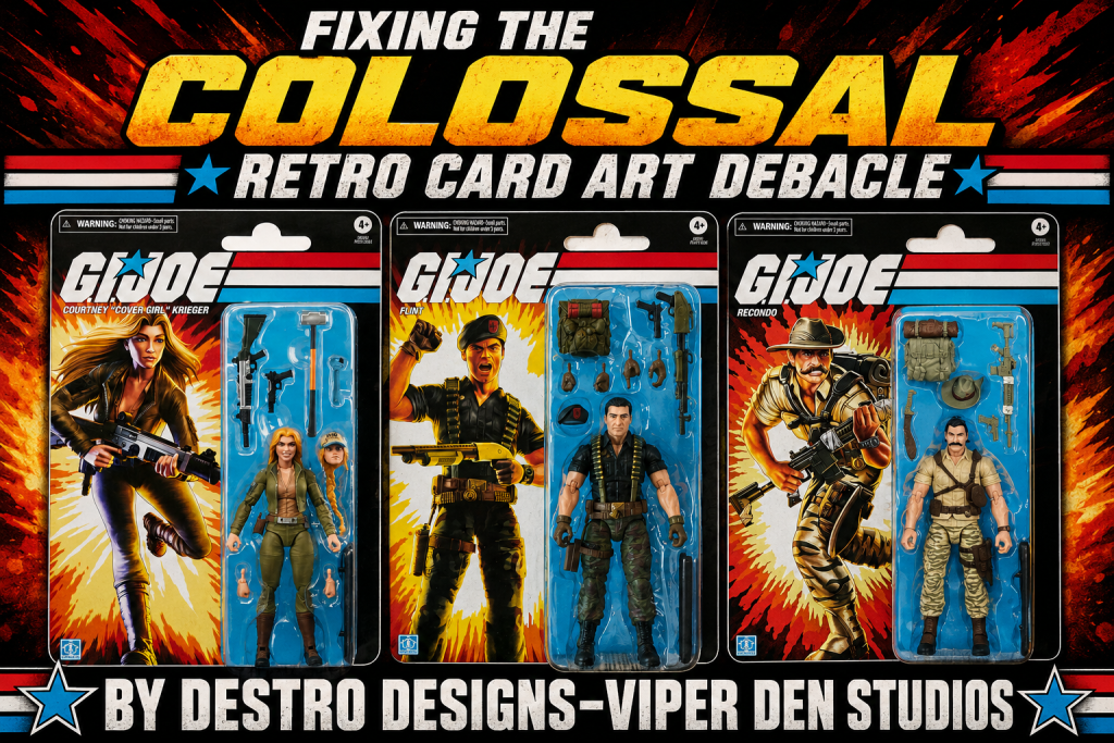
By Destro Designs – Viper Den Studios
As a young buck, I was firing on all collecting cylinders with G.I. Joe. And when it came to buying and collecting the figures, it was all about the Holy Trinity.
The Holy Trinity, as referenced in a previous article, is what made up the collecting experience:
- The Card Art
- The Figure
- The File Card
Arguably, for me, the card art was, in some cases, the most important part. When I looked at the figure, I saw what was on the card art.
I used to legitimately stare at those card fronts and the back of the packaging, studying all the other card arts I didn’t own yet but desperately wanted.
These weren’t goofy representations of a kid’s toy. These were badass dudes and dudettes looking absolutely incredible.
My favorite figures all have elite card art. When I look at Shockwave, I instantly see that original artwork, and that’s what really wets my whistle.
That’s why I was so damn hellfire mad when Hasbro started screwing the pooch with the retro card art on the Classified Retro line.
It’s bad enough for a billion-dollar company to lean on AI for projects like this, but there’s a special section of Hell reserved for whoever decided to ruin some of G.I. Joe and Cobra’s most iconic card art. Those folks can suffer like Prometheus—but instead of having their liver eaten every day, it’s their nutsack, and it grows back every 24 hours just in time for THE Raptor to return. Not a raptor… THE Raptor. A dude in a ridiculous cloth bird suit gnawing away with butter-knife teeth before wandering off until the next day.
My biggest complaint is the Snow Serpent. They didn’t give him the proper weapons, and in effect, they changed what may be the most iconic card art of them all. It’s truly baffling and horrific.
And don’t even get me started on abominations like good ol’ “Six-Digit Wild Bill,” where they tried to explain away the extra middle finger with some nonsense about the background colors or whatever excuse they gave.
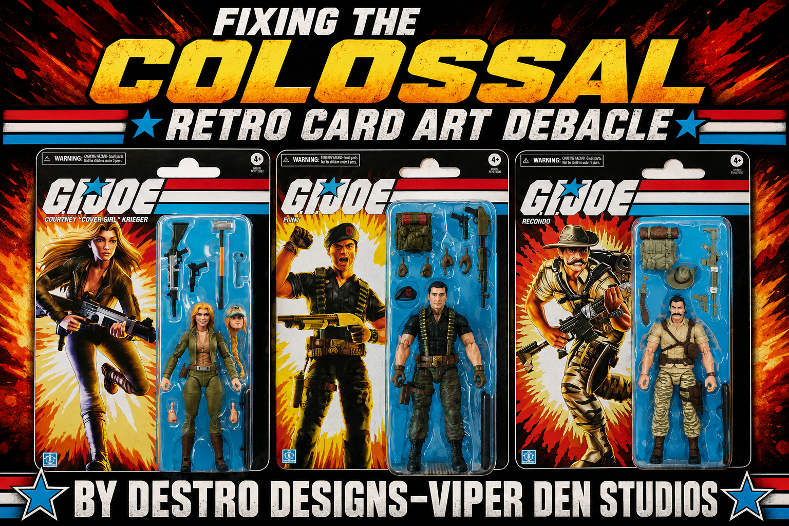
Or the infamous “Fellatio Flint,” whose already goofy pose somehow became exponentially worse when they gave him the mouth of one of those ridiculous ’80s inflatable dolls. It’s oddly oval and inexplicably left open—not in a battle cry, but in a way that makes it look like he’s ready to make a quick twenty bucks behind the Waffle House dumpster.
Needless to say, they really dropped the ball on a few of them. Epically bad.
But with that said, they’ve clearly heard my war cries regarding these artistic disasters. The most recent retro wave—Wild Bill, Grunt, and the Techno-Viper—shows a dramatic course correction.
They’ve gone back to the original 3¾-inch card art style, and I’m over here like Julie Andrews in The Sound of Music, dancing across a hillside meadow because these choices are just that good.
Mr. Positive loves being positive, but I’ll tee off like John Daly on anything that’s trash. After hitting a 400-yard drive criticizing the earlier choices, I’m more than happy to give the design team a high-five for embracing these classic looks.
I literally got home from vacation an hour ago, and I had two Techno-Vipers and two Grunts waiting for me—one of each to open and one of each for my Retro Classified carded collection.
To be fair, Grunt is an odd pose, and the way he’s awkwardly gripping the stock of his M-16 is still a little strange. But it’s faithful to the original artwork, and the colors absolutely pop without going overboard.
It’s dope.
No notes.
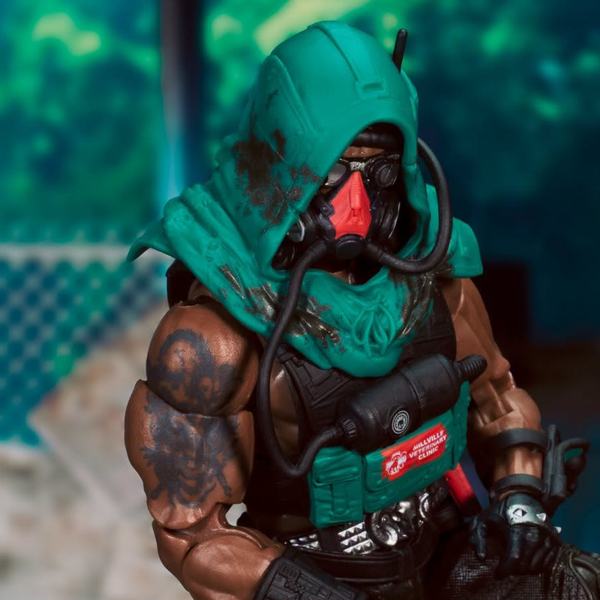
The Techno-Viper, however, is fantastic.
The backpack has been inverted, and that’s exactly how it should be. The tanks are now on top, which is technically accurate. It would make changing tanks much easier, while the tools remain accessible on the bottom if you set the pack down to work.
The original had red paint applications on the tanks and the rifle, and I would’ve loved to see that carried over. But honestly, they’ve upgraded this figure so much that I’m happy to ride the improvement wave.
The wrinkles and folds sculpted into the pants are outstanding. The updated wrist computer is awesome, and I actually like the vac-metal appearance of the rifle. I’ll probably add a little black detailing myself, but the color works.
This Retro Techno-Viper is going to become the squad leader of the seven mainline Techno-Vipers I already own.
It’s that good.
I don’t have Wild Bill yet, but from everything I’ve seen, he finally looks the part alongside Grunt and the Techno-Viper.
So yes, Hasbro absolutely screwed the pooch in spectacular fashion with some of those early retro releases.
But these latest figures?
They’re really coming around.
I sincerely hope they continue embracing the authentic retro card art throughout the Classified Retro line. It gives me hope that the right decisions are finally being made—or, at the very least, that they’re listening when the fanbase shows up carrying pitchforks in search of the design team.