
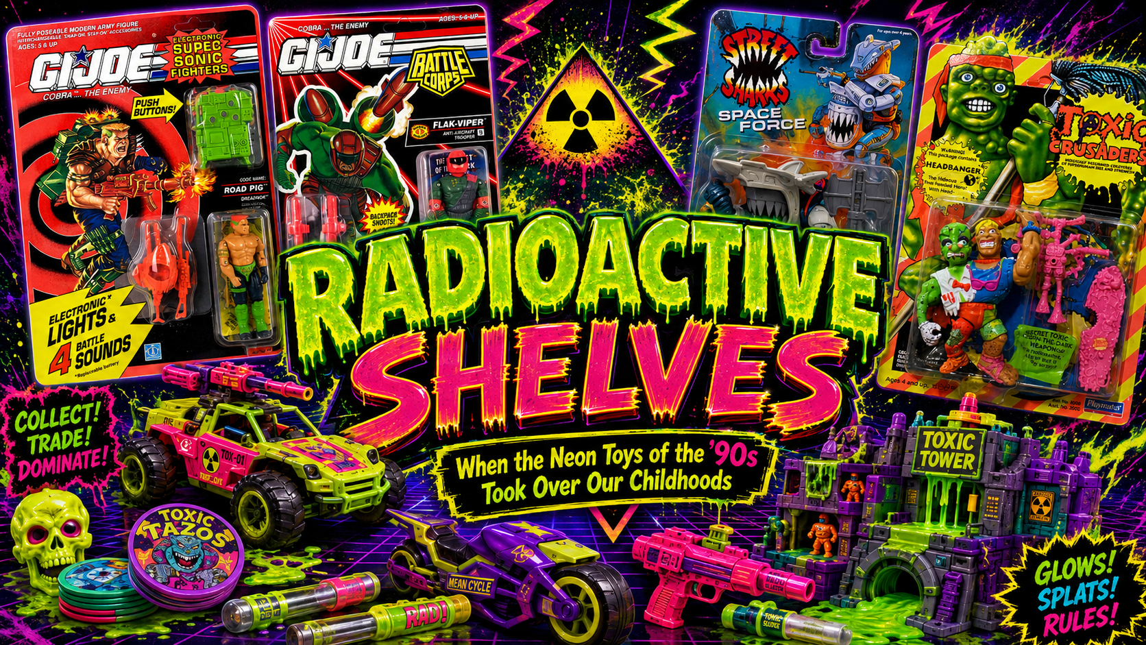
RADIOACTIVE SHELVES: When the Neon Toys of the ’90s Took Over Our Childhoods
There were fluorescent greens, nuclear yellows, radioactive oranges and enough electric blue plastic to make a blacklight jealous. To adult collectors raised on the military greens of early G.I. Joe, some of those toys eventually became punchlines.
But to a kid standing in Toys “R” Us?
They looked incredible.
Perhaps no line represents that transformation better than G.I. Joe Battle Corps. By 1993, Hasbro had grouped most of its standard Joe assortment under the Battle Corps banner while simultaneously experimenting with Mega Marines, Star Brigade and increasingly science-fiction-heavy concepts. Hasbro veteran Kirk Bozigian later explained that G.I. Joe was deliberately evolving from strictly military subject matter into a broader “boys action brand.” Remarkably, 1993 reportedly produced G.I. Joe’s best sales since 1986.
Those screaming colors weren’t entirely accidental, either.
Years earlier, when asked why brighter colors began appearing in G.I. Joe, Bozigian gave a wonderfully simple explanation: there was only so much designers could do with olive drab and khaki while trying to make figures exciting on store shelves. Color also helped communicate each character’s individual personality.
That philosophy exploded during the ’90s.
Battle Corps gave us characters splashed with purple, orange, yellow, blue and green, while Mega Marines went even further with science-fiction monsters and moldable “bio-armor.” Even veteran designer Ron Rudat, who established much of G.I. Joe’s original visual language, returned in late 1992 to assist Kurt Groen on the project that eventually became the wonderfully space-crazy Star Brigade. Another fascinating behind-the-scenes detail: G.I. Joe designers commonly produced several marker-colored “color studies,” and marketing ultimately selected the winning palette.
Hasbro wasn’t alone.
At Mattel, Street Sharks arrived like someone had poured an energy drink over an action-figure aisle. Original team member Alton Takeyasu has explained that the designers actually studied real sharks and sea creatures before exaggerating them into huge muscular heroes. Mattel’s surviving concept art reveals just how much experimentation occurred before those wonderfully ridiculous characters reached shelves.
Playmates was arguably even louder. Its 1991 Toxic Crusaders line embraced fluorescent mutants, outrageous designs and even glow-in-the-dark accessories. Meanwhile Bandai’s Mighty Morphin Power Rangers turned color itself into character identification: Red, Blue, Black, Yellow, Pink, Green and eventually White weren’t merely costume choices—the colors were part of the storytelling.
And that may be why these toys still hit collectors differently today.
We know a fluorescent-green machine gun makes absolutely no tactical sense.
We don’t care.
That color isn’t realistic military equipment anymore. It’s Saturday morning cartoons. It’s Nickelodeon slime. It’s arcade carpeting, Hypercolor shirts, Trapper Keepers and wandering through a toy aisle with five dollars burning a hole in your pocket.
Collectors aren’t merely buying Battle Corps figures today.
They’re buying back the moment when neon looked like the future.

Totally get it – that intense neon was just so much brighter and bolder than anything we saw before. I remember being obsessed with the Battle Corps figures!